Axis, a tech incubator dedicated to nurturing early-stage startups, needed a brand identity that captured their dynamic and supportive approach. My goal was to create a brand that resonated with ambitious entrepreneurs, visually differentiating Axis within the competitive incubator landscape and highlighting their commitment to fostering growth and community. The challenge was to create a modern and professional identity that balanced innovation with the reliability and expertise they offer.
Launching Axis:
Branding an Incubator for Tech Innovation.
Research & Strategy: My research started with analyzing existing tech incubator brands, identifying common visual themes and messaging strategies. I discovered a trend toward generic, corporate imagery that failed to capture the unique energy of the startup world. To differentiate Axis, I focused on their key strengths: personalized mentorship, a collaborative community, and a focus on tangible results. I conducted interviews with the Axis team and their target audience – aspiring entrepreneurs – to understand their needs and aspirations. This revealed a desire for a brand that felt both inspiring and trustworthy, reflecting the guidance and support Axis provides. This research informed the development of a brand strategy centered on "Launching the Next Generation of Tech Innovators."
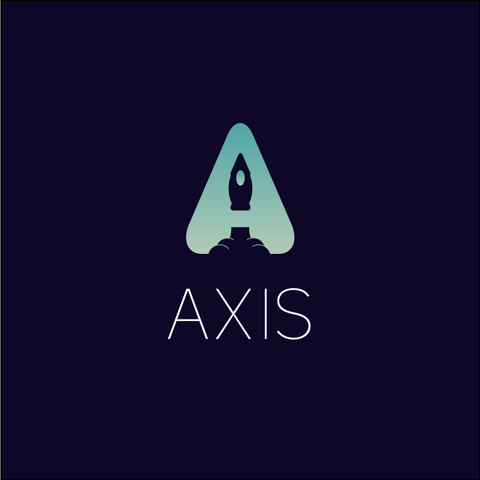
Concept Development: Initially, I explored several logo concepts, experimenting with abstract shapes and symbols related to growth and technology. Some early iterations featured interconnected nodes representing the collaborative aspect of Axis, while others used upward-pointing arrows to symbolize growth. However, these concepts lacked the distinct personality we were aiming for. I then pivoted towards a more literal approach, incorporating the rocket imagery to directly represent launch and trajectory. Combining this with the "A" of Axis created a unique and memorable mark. Several variations of the rocket within the "A" were explored, including minimalist line art and more detailed illustrations, ultimately settling on the streamlined silhouette for maximum impact and scalability. The triangular shape surrounding the rocket also subtly hinted at an upward trajectory, further reinforcing the concept of growth. The color palette evolved alongside the logo, starting with brighter, more playful hues before ultimately landing on the sophisticated blend of deep space blue and vibrant cyan to convey both stability and innovation. This iterative process allowed me to refine the visual identity until it perfectly embodied the brand strategy.
Design Process: