Hopping into Style:
Branding Wolf Creek Bum Bag.
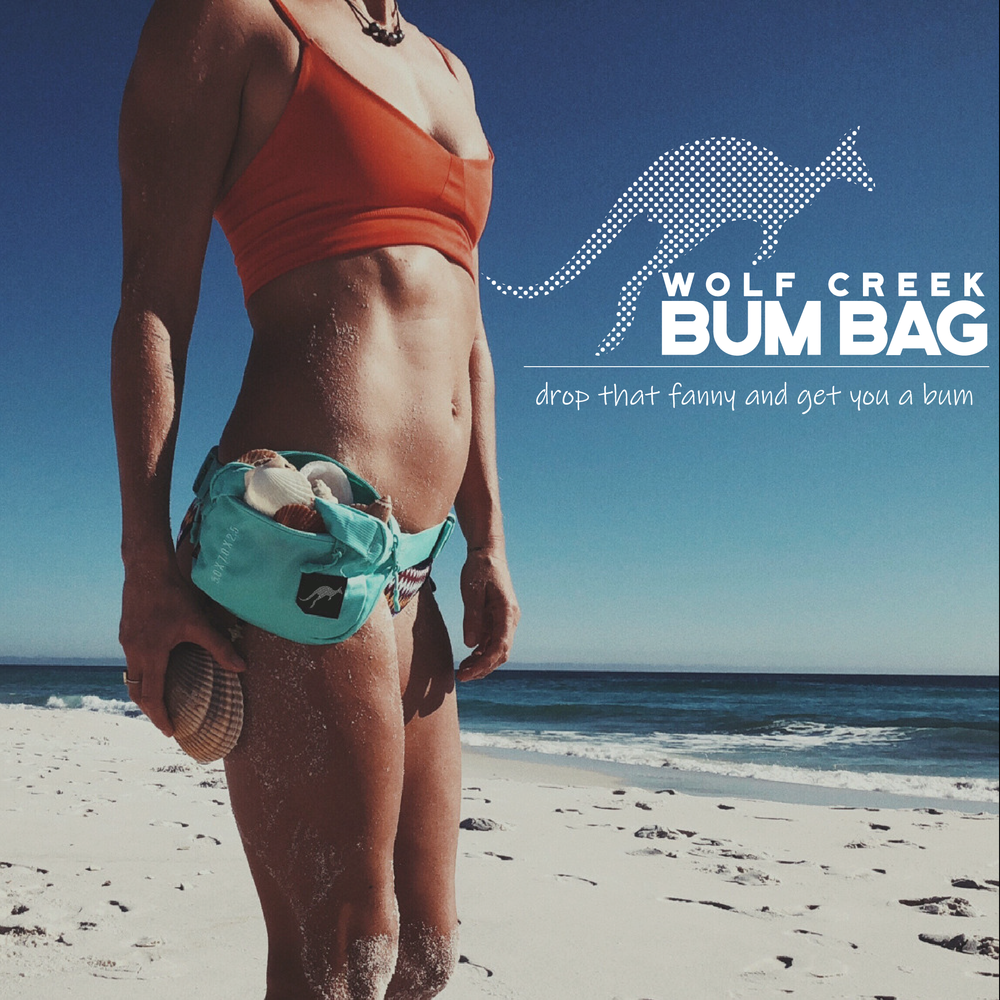
Wolf Creek Bum Bag, an Australian-based fanny pack company, wanted a brand identity that captured the adventurous, fun-loving spirit of their product and resonated with a target audience of outdoor enthusiasts, travelers, and festival-goers. My objective was to create a brand that stood out in the increasingly crowded market of hip bags and fanny packs, emphasizing the quality, functionality, and unique Australian identity of Wolf Creek Bum Bag. The challenge was to create a visual language that felt both modern and playful, appealing to a younger demographic while retaining a sense of ruggedness and durability.
Design Process:
Research & Strategy: My research began by analyzing the current trends in the bag and accessories market, paying particular attention to the resurgence of fanny packs and their evolution from purely functional items to fashionable accessories. Competitor analysis revealed a mix of minimalist, utilitarian brands and more vibrant, trend-focused brands. Wolf Creek Bum Bag aimed to occupy a unique space that blended practicality with personality. I conducted online surveys and focus groups with the target audience, exploring their usage habits, preferences, and associations with fanny packs. The research highlighted a desire for comfortable, durable bags that offered convenient storage without compromising style. The Australian connection also resonated strongly, suggesting an opportunity to incorporate elements of Australian culture and iconography into the brand. This research informed a brand strategy that emphasized adventure, freedom, and a distinctly Australian identity. The "Drop that fanny and get you a bum" tagline was developed to inject humor and playfulness into the brand, challenging the outdated perceptions of fanny packs and positioning them as a cool and stylish accessory.
Concept Development: The logo design process began by exploring various visual representations of the brand name and its Australian heritage. Early concepts included stylized wolves, abstract creek motifs, and representations of the Australian outback. However, these felt either too literal or too generic. The breakthrough came with the idea of using a kangaroo as the central icon. This instantly recognizable symbol of Australia perfectly captured the brand's adventurous spirit and playful personality. The kangaroo was stylized with a dotted pattern, giving it a modern, almost pixelated look that differentiated it from more traditional representations. The kangaroo’s posture – mid-hop – conveyed a sense of movement and energy, reinforcing the brand’s association with an active lifestyle. The color palette initially explored earthy tones and traditional Australian colors like green and gold. However, to appeal to a younger, more fashion-conscious audience, a brighter and more vibrant palette was chosen. The turquoise color of the bum bag itself became a key brand color, representing the freshness and energy of the outdoors. This was complemented by white and gray for the kangaroo and typography, creating a clean, modern look. The typography for "Wolf Creek Bum Bag" was chosen for its bold, slightly rounded appearance, which felt both friendly and adventurous. This strategic combination of a playful icon, vibrant colors, and bold typography resulted in a logo that effectively communicated the brand's unique personality and Australian heritage.