Crowning Streetwear Royalty:
Branding Deities:
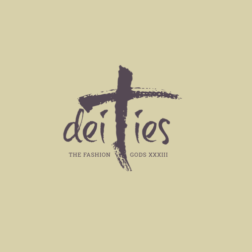
The Fashion Gods.
Deities: The Fashion Gods, a cutting-edge streetwear brand, sought a brand identity that conveyed their unique blend of artistry, exclusivity, and rebellious spirit. Their target audience is discerning fashion enthusiasts who appreciate high-quality craftsmanship, bold designs, and a brand that embodies their own individual style. My objective was to create a brand that stood out in the competitive streetwear landscape, establishing Deities as a symbol of elevated street style and a coveted brand for those who dare to be different. The challenge was to balance the raw energy of streetwear with a sense of refined luxury and timeless appeal.
Design Process:
Research & Strategy: My research began by immersing myself in the streetwear culture, analyzing key trends, competitor brands, and the evolving tastes of the target demographic. I observed a growing demand for streetwear that transcended fleeting trends, offering timeless pieces with a focus on quality and craftsmanship. Through interviews and online surveys, I gained deeper insights into the target audience's values and aspirations. They sought brands that reflected their individuality, confidence, and appreciation for artistry. This research informed a brand strategy centered around the concept of "deities" – individuals who possess an innate sense of style and who use fashion as a form of self-expression and empowerment. The brand needed to embody this sense of elevated style, appealing to those who see themselves as trendsetters and tastemakers.
Concept Development: The logo design process began by exploring a range of visual metaphors related to the "deities" concept. Initial ideas included classical iconography, celestial imagery, and abstract symbols of power. While visually compelling, these concepts lacked the raw, edgy energy that defines streetwear. The breakthrough came with the idea of using a stylized "cross" motif. This symbol, often associated with rebellion and counter-culture, was reinterpreted in a bold, brushstroke style to create a sense of raw energy and artistic expression. This resonated perfectly with the target audience's desire for individuality and nonconformity. The brand name, "deities," was set in a custom-designed script font, adding a touch of elegance and sophistication to balance the raw energy of the cross symbol. The color palette initially explored a range of vibrant hues, but ultimately, a more refined and understated approach was chosen. A muted, earthy tone was selected as the primary brand color, representing the brand's focus on quality and craftsmanship. This neutral backdrop allowed the bold graphics and apparel designs to take center stage. This strategic combination of a powerful symbol, custom typography, and a carefully curated color palette created a logo that effectively communicated the brand's unique identity and values.