Sharing the Ride, Sharing the Savings: Branding Dutch Mobile Rideshare.
Dutch Mobile Rideshare, a budget-conscious ridesharing app, sought a brand identity that conveyed their core value proposition: affordable and efficient transportation through shared rides. Targeting cost-conscious commuters and travelers, my objective was to create a brand that communicated the convenience, affordability, and social aspect of Dutch Mobile, differentiating it from traditional rideshare services and appealing to a demographic seeking both value and connection. The challenge was to create a visual language that felt modern, trustworthy, and community-oriented
Design Process:
Research & Strategy: My initial research focused on understanding the target audience – budget-minded travelers, students, and daily commuters – and their motivations for choosing ridesharing services. I analyzed existing rideshare brands, identifying a common focus on speed, convenience, and premium service, often at a higher price point. Dutch Mobile aimed to disrupt this market by offering a more affordable alternative through ride-sharing. Surveys and focus groups with the target demographic revealed a strong desire for lower fares, efficient routing, and a sense of community. This research informed a brand strategy centered around "A Ride with an Emphasis on Share," highlighting both the economic and social benefits of shared rides.
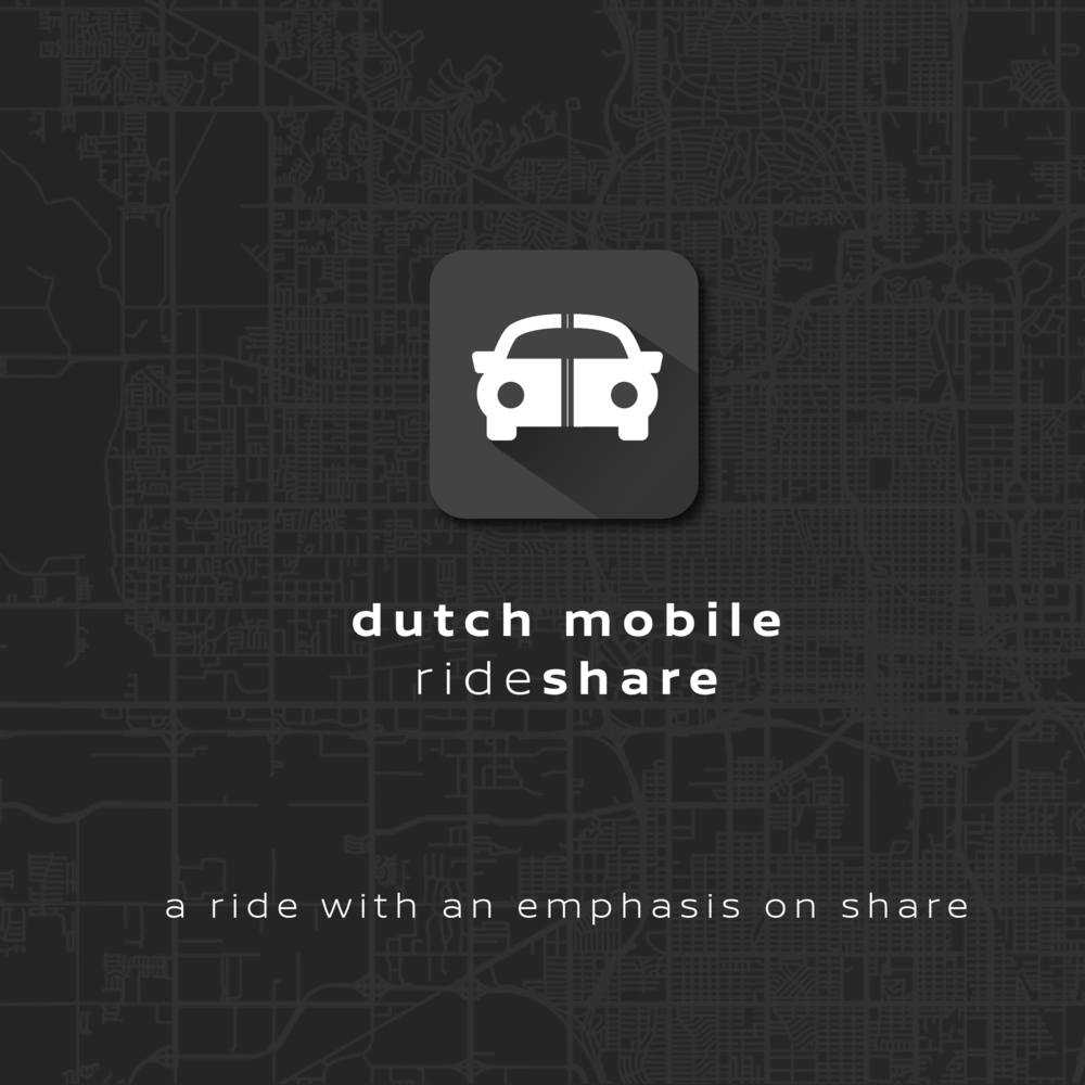
Concept Development: The logo design process began by exploring visual metaphors related to sharing, mobility, and the "Dutch" concept of splitting costs. Early ideas included split arrows, interconnected pathways, and stylized representations of people sharing a ride. While conceptually relevant, these lacked the simplicity and clarity needed for a mobile app icon. The breakthrough came with the idea of using a simple car icon with a vertical line down the center, representing the shared nature of the ride. This minimalist approach allowed for easy recognition and scalability across various digital platforms. The car icon was placed within a rounded square, adding a touch of modernity and friendliness. The color palette was chosen to convey trust, reliability, and efficiency. A dark gray was selected for the background and app icon, creating a sense of sophistication and professionalism. The car icon itself was white, providing clear contrast and visibility. The typography for "Dutch Mobile Rideshare" was selected for its clean, modern appearance. A sans-serif font with slightly rounded corners conveyed a sense of approachability and efficiency. The tagline "A ride with an emphasis on share" succinctly communicated the brand's core value proposition and reinforced the concept of shared rides. This strategic combination of a simple yet effective icon, clean typography, and a professional color palette resulted in a logo that effectively captured the essence of Dutch Mobile Rideshare's affordable and community-oriented approach to transportation.


