Igniting the Culinary Experience:
Branding Flint & Flame Grills.
Flint & Flame, creators of innovative hybrid fire freestanding grills, sought a brand identity that reflected the premium quality, versatility, and modern design of their products. Targeting outdoor cooking enthusiasts who appreciate both traditional grilling methods and cutting-edge technology, my objective was to create a brand that conveyed the superior performance and sophisticated style of Flint & Flame grills. The challenge was to capture the essence of both fire and precision, blending the primal appeal of open-flame cooking with the advanced features of their hybrid technology.
Design Process:
Research & Strategy: My research began by delving into the outdoor cooking market, analyzing competitor brands, grilling trends, and consumer preferences. I discovered a growing interest in hybrid grills that offer the versatility of both gas and charcoal cooking. Through online surveys and interviews with grilling enthusiasts, I identified key desires: high-quality construction, precise temperature control, ease of use, and a stylish design that enhances the outdoor cooking experience. This informed the brand strategy, focusing on Flint & Flame as the ultimate tool for culinary creativity and outdoor entertaining. The brand needed to evoke a sense of sophistication, performance, and the joy of cooking with fire.
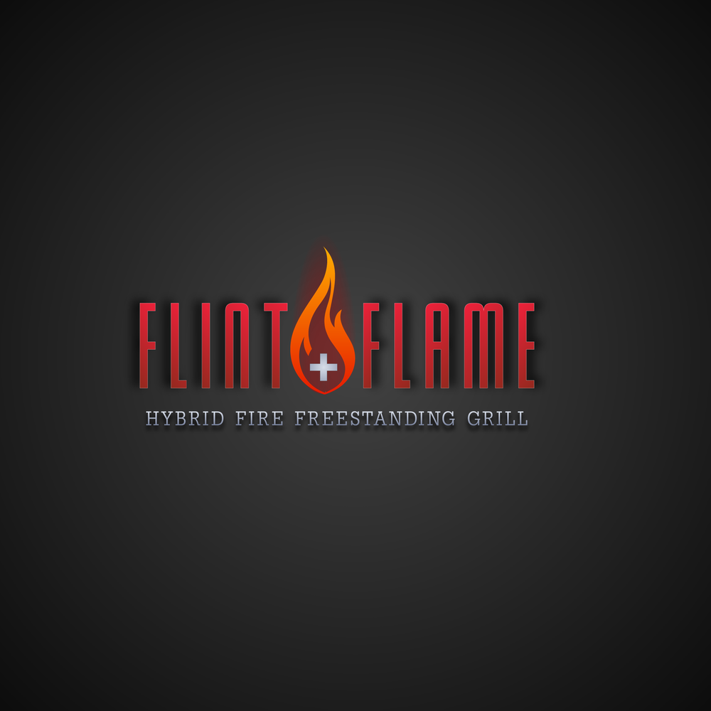
Concept Development: The logo design process began by exploring visual representations of fire, flint, and grilling. Initial concepts included realistic flames, stylized depictions of flint stones, and abstract grill icons. While visually interesting, these lacked the desired level of sophistication and modernity. The breakthrough came with the idea of abstracting the flame into a stylized icon that subtly incorporated the "plus" symbol, representing the hybrid nature of the grill. This clean and modern approach allowed the flame to become a powerful symbol of both traditional fire and advanced technology. The flame icon’s color was carefully considered, opting for a gradient blend of orange and red to capture the dynamic nature of fire while maintaining a sense of refinement. The typography for "Flint & Flame" was selected to convey a sense of strength, precision, and quality. A bold, sans-serif font with clean lines and subtle letter spacing was chosen, reflecting the grill's modern design and precise engineering. The tagline "Hybrid Fire Freestanding Grill" further reinforced the brand's key differentiator and provided clarity about the product offering. The dark gray background created a sense of sophistication and allowed the logo and tagline to stand out prominently. This strategic combination of a minimalist icon, strong typography, and a carefully chosen color palette resulted in a logo that effectively captured the essence of Flint & Flame's innovative grilling technology.