Guiding Wellness Journeys: Branding Lighthouse Weightloss and Wellness Center.
Lighthouse Weightloss and Wellness Center, a 24-hour gym offering comprehensive fitness and nutrition services, sought a brand identity that conveyed their holistic approach to wellness and their commitment to guiding clients towards their health goals. Targeting individuals seeking personalized support and expert guidance on their weight loss and wellness journeys, my objective was to create a brand that conveyed trust, expertise, and a sense of positive transformation, differentiating Lighthouse from traditional gyms and highlighting their comprehensive, around-the-clock support system. The challenge was to create a visual language that felt both motivating and supportive, reflecting the center's commitment to both physical and mental well-being.
Design Process:
Research & Strategy: My initial research focused on understanding the target audience – individuals seeking to improve their health and well-being – and their motivations for joining a wellness center. I analyzed competitor gyms and wellness centers, noting their strengths and weaknesses in terms of branding and service offerings. Surveys and interviews with potential clients revealed a desire for personalized guidance, expert support, and a sense of community. Many expressed frustration with traditional gyms that lacked the holistic approach and ongoing support they needed to achieve lasting results. This research informed a brand strategy centered on the concept of "guidance," positioning Lighthouse as a beacon of hope and support that helps clients navigate their wellness journeys and achieve their personal health goals.
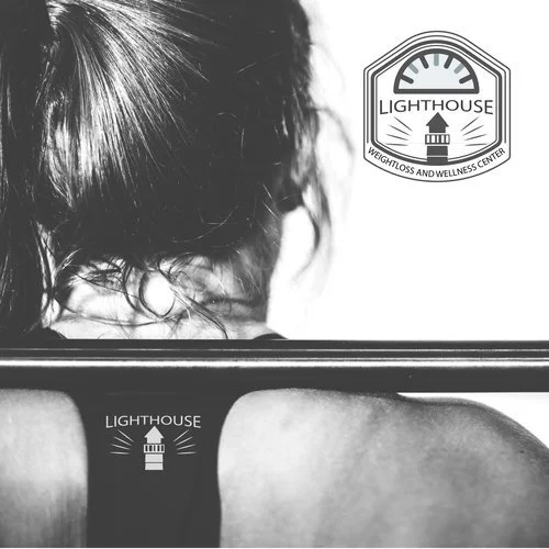
Concept Development: The logo design process began by exploring visual metaphors related to guidance, wellness, and transformation. Early concepts included abstract representations of growth, stylized human figures, and compass imagery. While visually appealing, these lacked the specific connection to the "lighthouse" concept. The breakthrough came with the idea of incorporating a stylized lighthouse icon into the logo. This instantly recognizable symbol of guidance and safety perfectly captured the brand's core value proposition. The lighthouse was simplified and modernized, using clean lines and geometric shapes to create a contemporary and versatile logo. The beam of light emanating from the top of the lighthouse was stylized to suggest an upward arrow, symbolizing progress and positive transformation. The color palette was chosen to convey trust, serenity, and vitality. A soft, calming blue was used for the lighthouse beam, representing hope and clarity. A warm gray was used for the lighthouse structure, conveying stability and reliability. The typography for "Lighthouse Weightloss and Wellness Center" was selected for its clean, modern appearance. A sans-serif font with a slightly rounded feel conveyed a sense of approachability and support. This strategic combination of a powerful visual metaphor, calming color palette, and approachable typography resulted in a logo that effectively communicated the essence of Lighthouse's guiding and supportive approach to wellness.


