Capturing Transformation: Branding Miracle Moments on OWN.
Miracle Moments, a new motivational series for the OWN network, required a brand identity that captured the transformative power of pivotal life experiences. Targeting a broad audience seeking inspiration and insights from influential figures, my objective was to create a brand that conveyed the emotional depth, authenticity, and uplifting nature of the series. The challenge was to visually represent the concept of a "miracle moment" – a defining event that alters the trajectory of one's life – and to create a brand that resonated with the OWN network's established audience and its focus on personal growth and empowerment.
Design Process:
Research & Strategy: My research began by examining existing OWN network programming and analyzing their visual style, target audience, and brand values. OWN's focus on authenticity, emotional connection, and personal transformation provided a strong foundation for the Miracle Moments brand. I reviewed similar interview-based shows and motivational content to understand the visual language and messaging that resonated with the target audience. The research highlighted a desire for authentic storytelling, relatable experiences, and a sense of hope and inspiration. This informed a brand strategy centered around the transformative power of "miracle moments," emphasizing the emotional impact of these defining life experiences and their potential to inspire positive change.
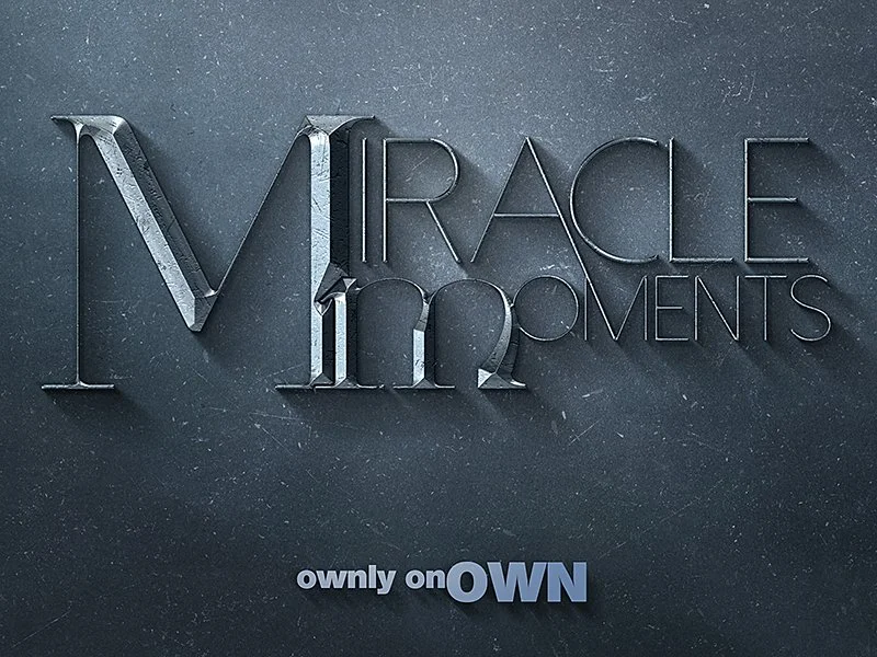
Concept Development: The logo design process began by exploring various visual metaphors related to miracles, transformation, and pivotal moments. Initial ideas included glowing orbs, butterflies emerging from cocoons, and abstract representations of change. While visually appealing, these felt either too literal or too abstract to capture the emotional depth of the series. The breakthrough came with the idea of focusing on the typography itself. The title, "Miracle Moments," was custom-designed with an elegant, slightly distressed typeface. The "M" of "Miracle" and the "m" of "Moments" were intertwined and elongated, creating a visual symbol of interconnectedness and the ripple effect of transformative experiences. The metallic, almost sculpted appearance of the typography added a sense of weight and significance, reinforcing the importance of these pivotal moments. The color palette was chosen to convey a sense of hope, inspiration, and timeless wisdom. A cool, steely gray was selected as the primary color, representing strength, resilience, and the enduring impact of miracle moments. This color also provided a sophisticated and elegant backdrop for the metallic typography. The OWN network branding was incorporated subtly at the bottom of the logo, maintaining consistency with the network's overall visual identity. This strategic combination of powerful typography, a refined color palette, and subtle branding created a logo that effectively communicated the transformative nature of Miracle Moments and its potential to inspire viewers on their own personal journeys.