Unlocking Literacy:
Branding Read Fox, A Clever Way to Learn.
Read Fox, an online reading platform, sought a brand identity that captured their innovative approach to literacy education and appealed to learners of all ages. Their goal was to create a fun and engaging learning experience that fostered a love of reading. My objective was to develop a brand that conveyed the platform's accessibility, effectiveness, and playful learning environment, differentiating it from traditional, often dry, educational resources. The challenge was to create a visual identity that resonated with both children and adults, conveying both the playful nature of the platform and the serious impact it has on literacy skills.
Design Process:
Research & Strategy: My research began by examining existing online reading platforms and educational resources. I found a common trend toward overly simplistic or childish designs for younger learners and overly academic or sterile designs for adult learners. Read Fox needed to strike a balance, creating a visually appealing and engaging brand that resonated with learners of all ages. Through surveys and user testing, I gained insights into learner motivations and preferences. A key finding was the importance of a fun and engaging learning experience, regardless of age. Learners also valued personalized learning paths, interactive exercises, and a sense of community. This research informed a brand strategy centered on "A Clever Way to Learn," emphasizing the platform's innovative approach, its focus on engagement, and its ability to cater to diverse learning styles.
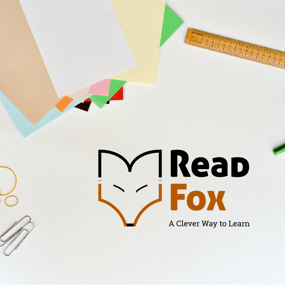
Concept Development: The logo design process began by exploring various visual metaphors related to reading, learning, and foxes. Initial ideas included stylized books, abstract letters, and realistic fox illustrations. However, these felt either too generic or too childish. The breakthrough came with the idea of combining a stylized fox face with an open book. The fox, known for its cleverness and cunning, became a symbol of the platform's innovative teaching methods. The open book represented the gateway to knowledge and the joy of reading. Several iterations of the fox/book icon were explored, ultimately settling on a minimalist design that used clean lines and simple shapes to create a modern and versatile logo. The fox's eyes, cleverly formed by negative space within the book's pages, added a touch of whimsy and intelligence. The color palette was carefully chosen to balance playfulness and sophistication. A warm, inviting orange was used for the fox, representing enthusiasm and creativity. Black was used for the book and outline, adding a touch of authority and grounding the design. The typeface for "Read Fox" was selected for its readability and friendly appeal. A slightly rounded, sans-serif font was chosen, conveying a sense of approachability and modernity. The tagline, "A Clever Way to Learn," succinctly communicated the platform's core value proposition and reinforced the fox's association with intelligence and innovation. This strategic combination of a clever visual metaphor, clean typography, and a balanced color palette created a logo that effectively captured the essence of Read Fox's unique approach to literacy education