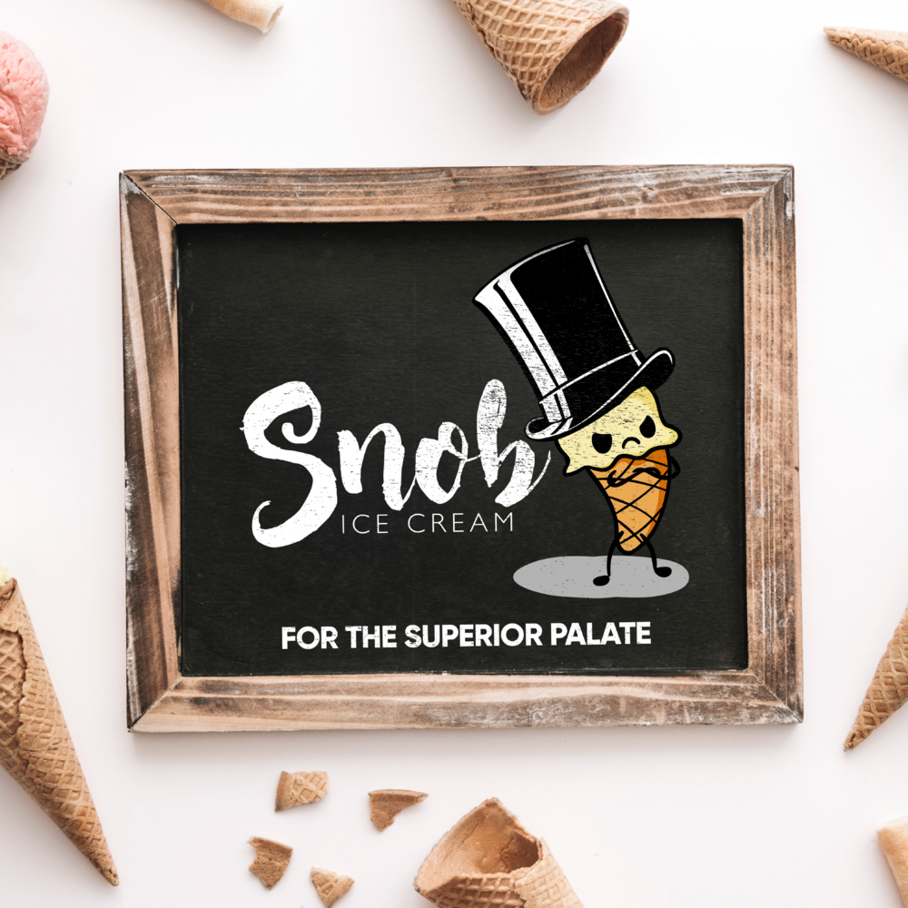
A Scoop of Sophistication: Branding Snob Ice Cream.
Snob Ice Cream, a high-end ice creamery, sought a brand identity that reflected its commitment to unique, premium-quality ice cream and targeted a discerning customer base. They wanted to convey a sense of exclusivity, sophistication, and playful indulgence. My objective was to create a brand that stood out in the competitive ice cream market, communicating both the superior quality of their product and their tongue-in-cheek embrace of the "snob" label. The challenge was to balance the playful personality of the brand with the elegance and refinement associated with high-end culinary experiences.
Design Process:
Research & Strategy: My research began with an analysis of the high-end ice cream market, examining competitor brands, flavor trends, and consumer preferences. I identified a growing demand for unique and adventurous flavor profiles, as well as a desire for artisanal, small-batch production. Surveys and interviews with the target demographic – affluent millennials and Gen Z consumers – revealed an appreciation for quality ingredients, innovative flavor combinations, and brands that aligned with their own sense of sophisticated indulgence. This research informed a brand strategy centered around the concept of "snobbery" as a badge of honor, celebrating a discerning palate and a passion for the finer things in life, including exceptional ice cream.
Concept Development: The logo design process began by exploring various visual representations of the "snob" concept. Initial ideas included monocle-wearing characters, top hats, and other symbols of aristocratic refinement. However, these felt too literal and lacked the desired playfulness. The breakthrough came with the idea of personifying a scoop of ice cream as a sophisticated character, complete with a top hat and a slightly disapproving expression. This playful approach allowed the brand to embrace the "snob" label with a touch of irony and self-awareness. The character's simple design, with clean lines and minimal details, kept the focus on the ice cream itself while still conveying a sense of personality. The color palette was carefully chosen to balance playfulness and sophistication. The light yellow of the ice cream evoked a sense of creamy richness, while the black of the top hat and the dark gray of the shadow added a touch of elegance and mystery. The typography for "Snob Ice Cream" was selected for its classic yet contemporary feel. A script font with a slight flourish conveyed a sense of handcrafted quality and playful sophistication. The tagline, "For the Superior Palate," further reinforced the brand's positioning and appealed to the target audience's discerning taste. This strategic combination of a playful character, sophisticated color palette, and elegant typography created a logo that effectively communicated the essence of Snob Ice Cream's unique brand identity