Brewing a Bold Brand: Wicked Cup Coffee & Tea Co.
Wicked Cup Coffee & Tea Co. tasked me with creating a brand identity that captured their mischievous spirit and commitment to crafting exceptional, artisanal beverages. They wanted to appeal to a coffee and tea-loving audience that appreciates quality, creativity, and a touch of playful rebellion. My objective was to develop a brand that stood out in the crowded café market, conveying both the premium nature of their products and their unique, "wicked" personality. The challenge was balancing a sense of fun with the sophistication expected of a specialty coffee and tea establishment.
Design Process:
Research & Strategy: My research began by delving into the competitive landscape of coffee and tea brands. I noticed a prevalence of either overly serious, minimalist brands or overly whimsical, cartoonish ones. Wicked Cup needed to occupy a unique space that blended high quality with playful intrigue. I conducted surveys and interviews with target consumers, exploring their preferences in coffee and tea, their brand perceptions, and what they looked for in a café experience. This research highlighted a desire for authenticity, unique flavor profiles, and a brand that resonated with their own sense of individuality. The "wicked" aspect of the brand resonated strongly, suggesting a playful rebellion against the ordinary, which became a central theme in the brand strategy.
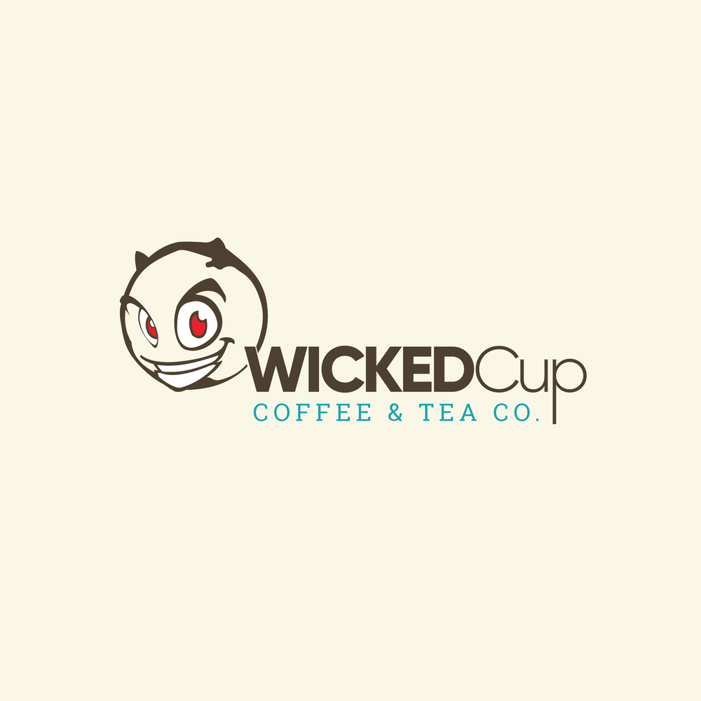
Concept Development: The logo design process began with exploring various visual representations of the "wicked" concept. Initial ideas included stylized flames, abstract swirls, and mischievous animal characters. However, these felt either too generic or too childish. The idea of a "wicked" character emerged, and several iterations were explored, ranging from gargoyles to imps to more abstract figures. The final "impish" character with the sly grin and devilish red eyes struck the right balance of playfulness and sophistication. The character’s round shape also subtly suggested a coffee bean or tea leaf. The color palette initially explored darker, more gothic tones. However, to avoid alienating a broader audience, we shifted towards a more balanced approach. The rich brown became the primary brand color, representing the richness and quality of the coffee and tea, while the light cream background provided a neutral canvas. The pop of turquoise was strategically used as an accent color to add a touch of vibrancy and modernity. Typography explorations focused on fonts that felt both classic and contemporary, ultimately selecting a bold, slightly rounded typeface for "Wicked Cup" to emphasize the playful nature of the brand and a more refined serif font for "Coffee & Tea Co." to add a touch of elegance. This careful selection of typography, color, and character design ensured that the final logo effectively communicated the brand's unique personality and values.