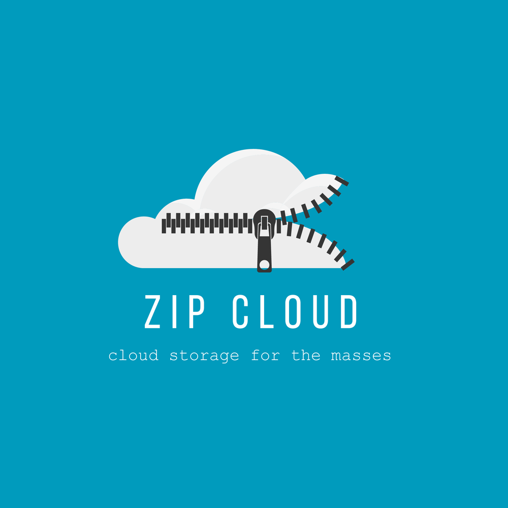
Unzipping Seamless Storage: Branding Zip Cloud.
Zip Cloud, a cross-platform cloud storage app, sought a brand identity that communicated its core value proposition: simple, secure, and accessible storage for everyone. Targeting a broad audience of mobile and desktop users, my objective was to create a brand that conveyed the ease of use, reliability, and affordability of Zip Cloud, differentiating it from more complex and expensive cloud storage solutions. The challenge was to create a visual identity that felt both modern and approachable, reflecting the seamless and user-friendly nature of the app.
Design Process:
Research & Strategy: My research began by analyzing the competitive landscape of cloud storage providers. I identified a common trend towards overly technical or corporate branding that often intimidated non-tech-savvy users. User reviews and online forums highlighted common pain points: complicated interfaces, confusing pricing plans, and a lack of cross-platform compatibility. Zip Cloud aimed to address these issues by offering a truly user-friendly and accessible solution. The research informed a brand strategy centered on simplicity, security, and affordability, positioning Zip Cloud as the "cloud storage for the masses."
Concept Development: The logo design process began by exploring visual metaphors related to cloud storage, compression, and accessibility. Early concepts included abstract cloud shapes, stylized data streams, and locked boxes. While visually appealing, these lacked the desired level of clarity and memorability. The breakthrough came with the idea of integrating a zipper into the cloud icon. This instantly recognizable symbol cleverly communicated the core concepts of compression and accessibility, suggesting the ease with which users can "unzip" their files from the cloud. The zipper also served as a visual metaphor for securing and protecting data. The cloud icon was kept simple and clean, using a bright white color to convey a sense of lightness and accessibility. The zipper was depicted in a dark gray, providing contrast and a touch of sophistication. The typography for "Zip Cloud" was chosen to reflect the brand's user-friendly approach. A clean, sans-serif font with rounded corners was selected, conveying a sense of approachability and modernity. The vibrant blue background provided a strong foundation for the logo, creating a sense of trust and reliability. The tagline "cloud storage for the masses" succinctly reinforced the brand's commitment to affordability and accessibility. This strategic combination of a clever visual metaphor, clean typography, and a vibrant color palette resulted in a logo that effectively communicated the essence of Zip Cloud's simple, secure, and accessible storage solution.


