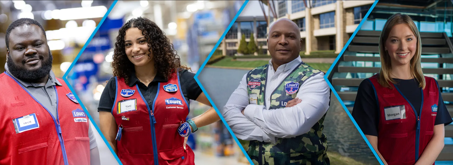
lowe’s home improvement
Streamlining Pro Resources: UX for Lowe's Pro Credit & Benefits Experience
PROJECT OVERVIEW
Lowe's Home Improvement, a top retailer for homeowners and contractors, aimed to enhance the Pro credit card application and benefits experience. I led the UX design for the application flow, researched Pro user needs, and created a mobile-first benefits experience. The project focused on delivering a seamless, intuitive, and valuable experience for Pros while improving accessibility on web and mobile platforms.

KEY WINS

THE CHALLENGE
Lowe's identified several key challenges surrounding the Pro credit and benefits experience:
Complex Credit Application: The existing credit card application process was lengthy and cumbersome, leading to abandonment and frustration.
Poor Mobile Experience: The credit application was not optimized for mobile devices, resulting in low completion rates from mobile users.
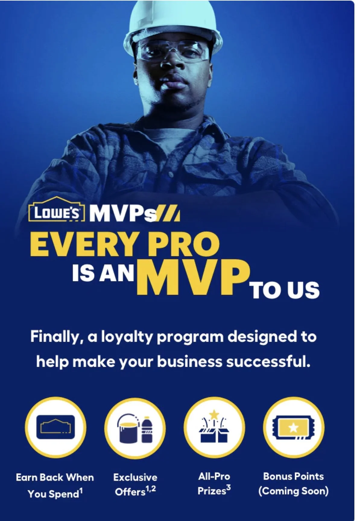
Lack of Clarity Around Benefits: Pro customers were often unaware of the full range of benefits available to them, leading to underutilization.
Inconsistent User Experience: The web and mobile experiences for accessing and managing Pro benefits were inconsistent and disjointed.
THE GOAL
Our goal was to redesign the Lowe's Pro credit card application and benefits experience to:
Simplify and streamline the credit card application process for increased completion rates.
Optimize the credit application for mobile devices to cater to the on-the-go needs of Pro contractors.
Clearly communicate the value proposition of the Pro benefits program to drive engagement and utilization.
Create a consistent and user-friendly experience across all platforms (web and mobile) for managing Pro benefits.
DISCOVERY & RESEARCH
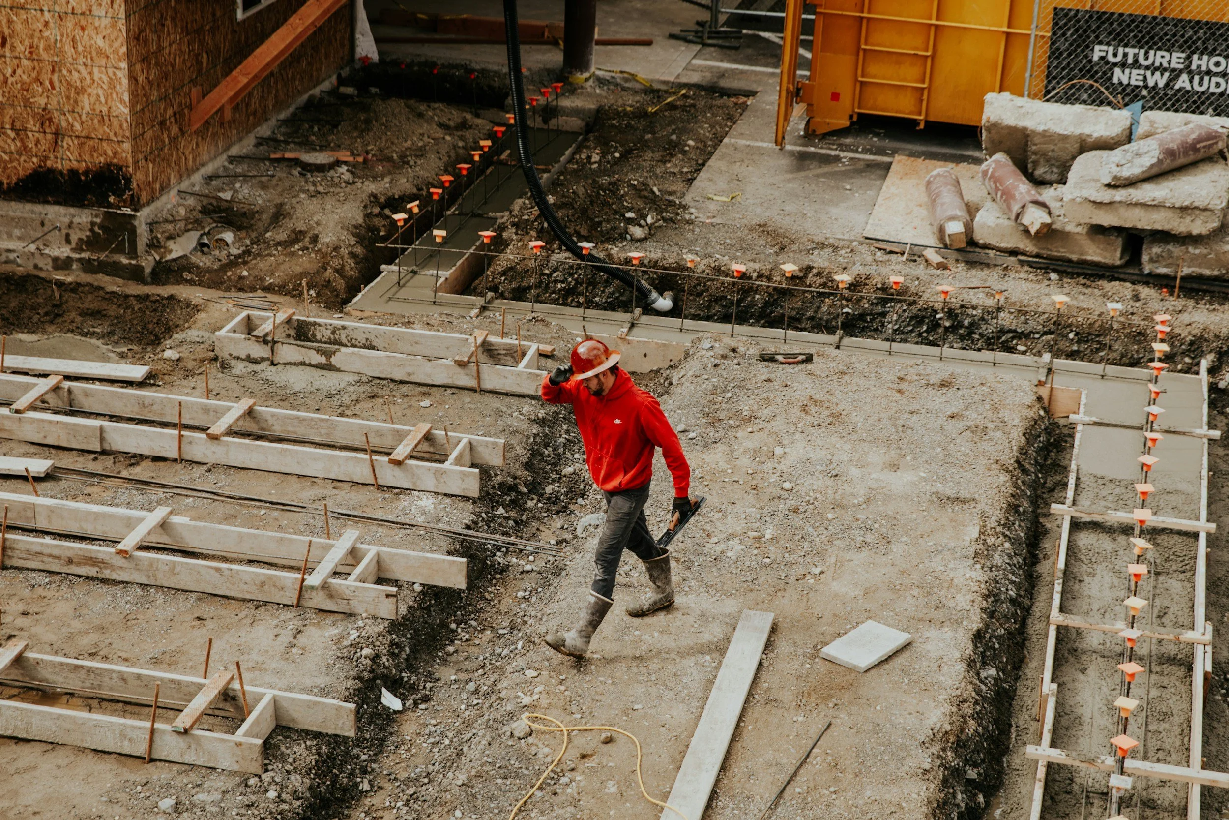
The Context: High Friction on the Job Site
DESIGN & PROTOTYPING
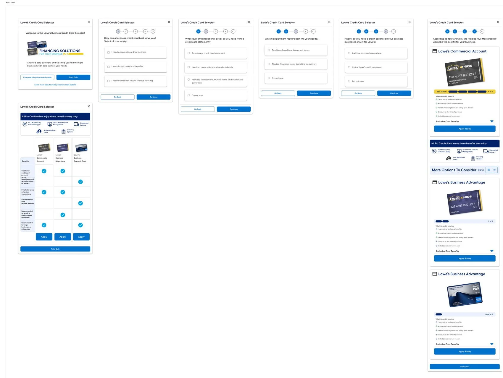
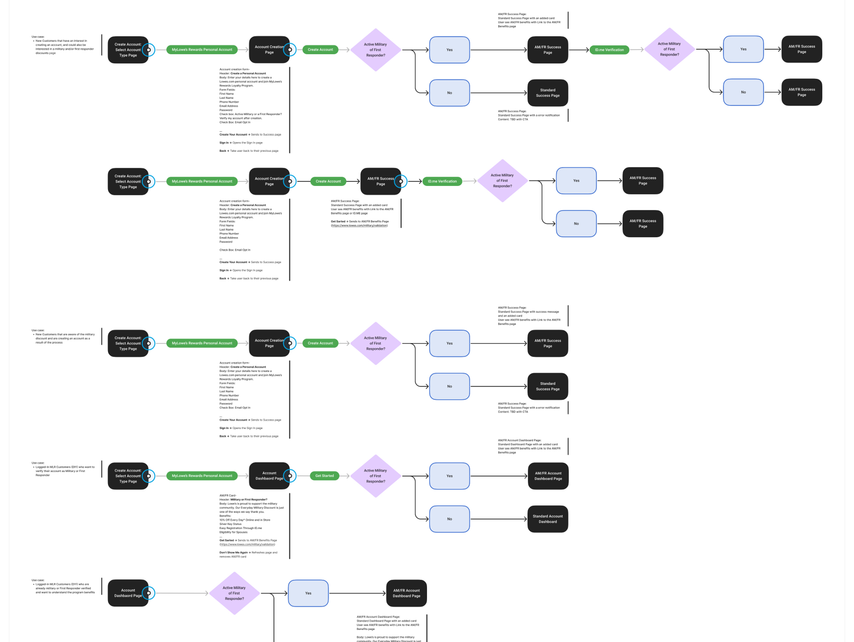
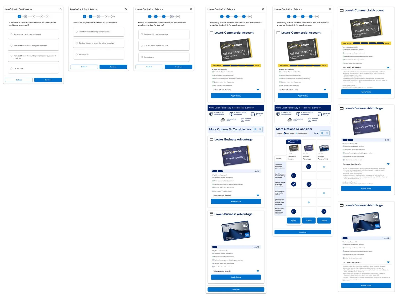
IA Refinement
Re-designed the IA for the Pro benefits section on the Lowe's website and mobile app to ensure that benefits were easily discoverable and accessible.
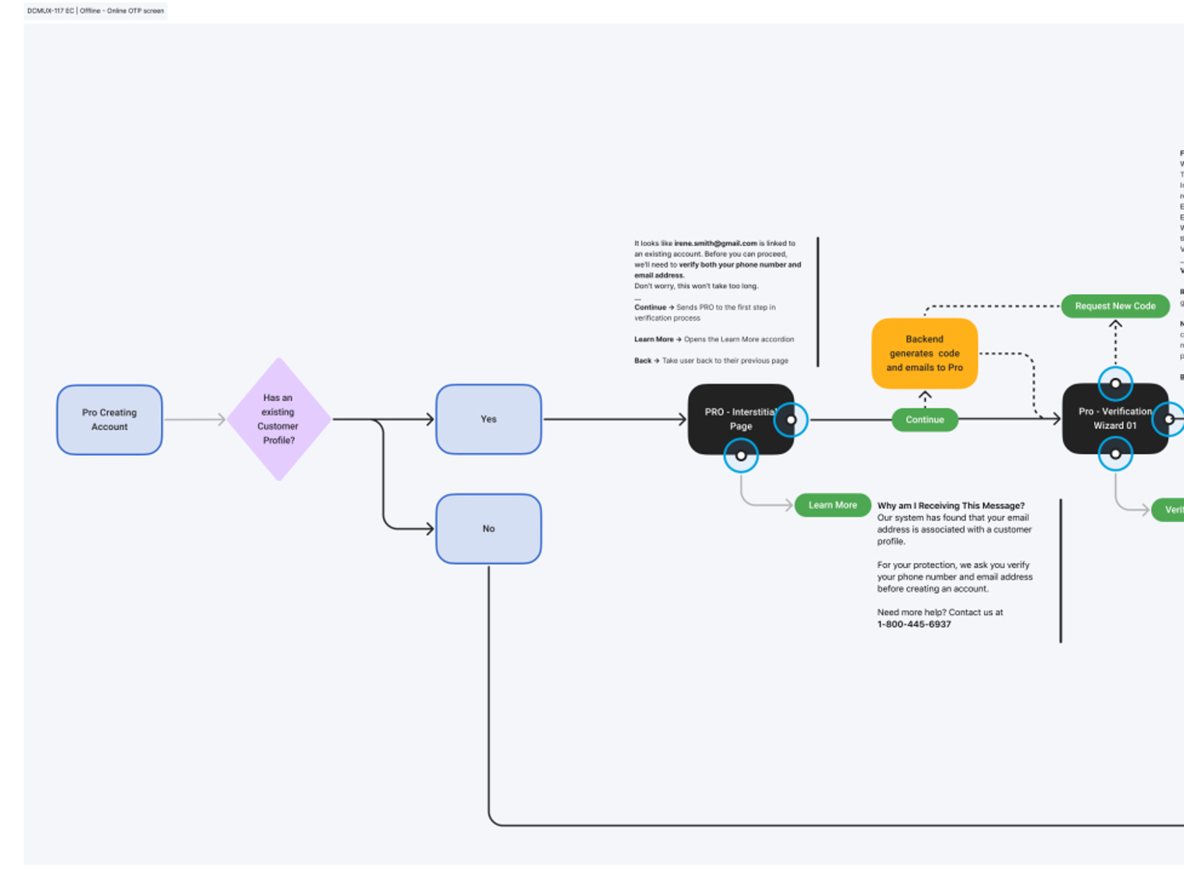
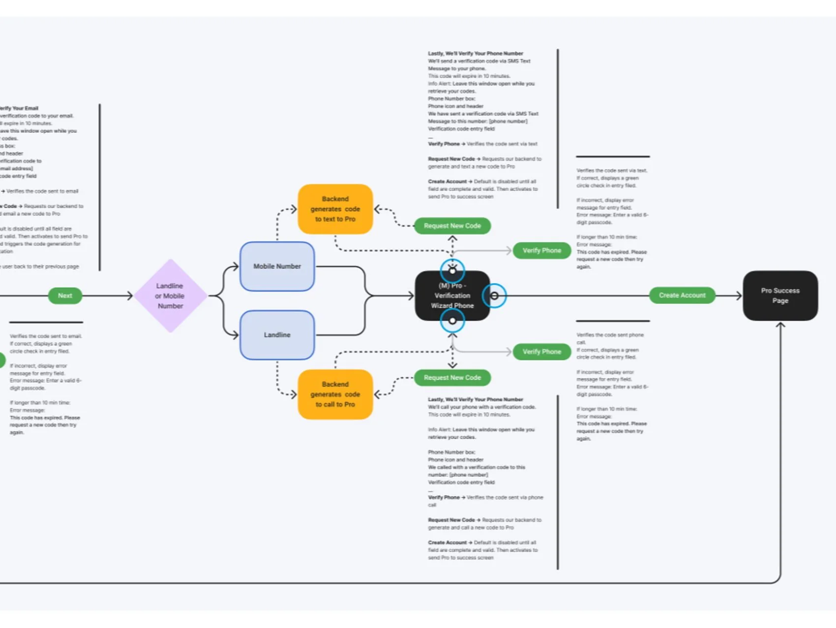
Interactive Prototyping
Developed interactive prototypes of the Pro benefits dashboard on both web and mobile to test different design concepts and user flows.
A/B Testing
(CTA placement)
Conducted A/B testing on different call-to-action placements and messaging for promoting the Pro credit card application.
Simplified Credit Application Flow:
Reduced form fields by 30% by integrating auto-fill APIs, reducing drop-off at this critical step.
KEY FEATURES & FUNCTIONALITY
Pro customers aren't sitting at desks. They are applying for credit in the aisle of a store or on a construction site. The legacy application failed because it required desktop-level patience in a mobile-first environment.
Wireframing & Mockups
Created low-fidelity wireframes and high-fidelity mockups of the redesigned credit card application flow, focusing on simplifying the steps and optimizing for mobile
lESSONS LEARNED:
This project reinforced the importance of:
Understanding the Unique Needs of Specific User Groups: Tailoring the user experience to the specific needs of Pro contractors is crucial for driving engagement and satisfaction.
Mobile-First Design: Prioritizing the mobile experience is essential for reaching users on the job site.
Clarity and Simplicity: A clear and simple user interface is essential for reducing friction and maximizing user success.
Data-Driven Design Decisions: Using data from user research and A/B testing is crucial for making informed design decisions.
CONCLUSION
This project provided me with valuable experience in designing complex financial applications, driving engagement with loyalty programs, and collaborating with a cross-functional team to deliver a seamless user experience. By focusing on user needs and employing a data-driven design approach, I helped Lowe's create a more valuable and rewarding experience for its Pro customers, driving business growth and strengthening customer loyalty.

Next…